ÉpongeBöb
services de nettoyage

Title: ÉPONGEBÖB
SECTION: CLEANING SERVICES
Design & study: Ali Taifour
Production: White Hole Studio
Type: Logo & visual identity design
Date and location: Canada, 08-06-2023
ÉPONGEBÖB
SERVICES DE NETTOYAGE
At ÉpongeBöb, they're dedicated to ensuring clean and healthy environments. With a team of experienced professionals and cutting-edge tools, they offer eco-friendly cleaning solutions. Known for their attention to detail, reliability, and personalised service, so they go the extra mile to exceed your expectations. Whether you need one-time deep cleaning or ongoing maintenance, ÉpongeBöb provides flexible options to fit your needs. The services cover residential, AirBnb, window, office, and restaurant cleaning, as well as outdoor maintenance and waste bag replacement. With daily, weekly, and monthly contracts, ÉpongeBöb is trusted partner for cleanliness and satisfaction.
Choose ÉpongeBöb for a spotless, safe, and comfortable environment.
Logo Concept
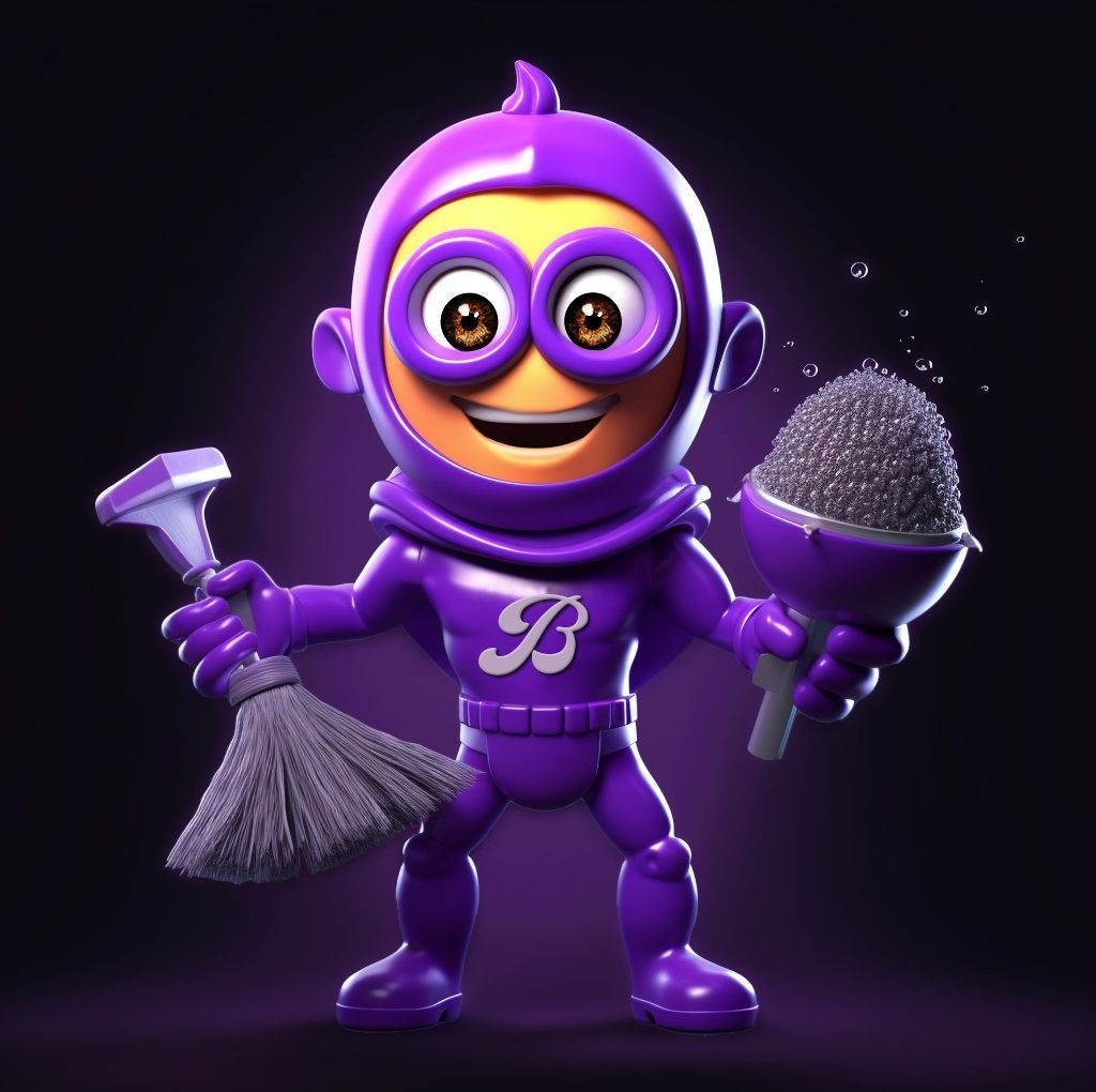
Their logo design incorporates a unique combination of elements that reflect both the company's vision and the personality of it's founder, Bob Rizk.
ÉpongeBöb is proudly named after its owner,
Bob Rizk. The inclusion of “Sponge Bob” in the logo pays homage to their founder and creates a personal connection to the company.
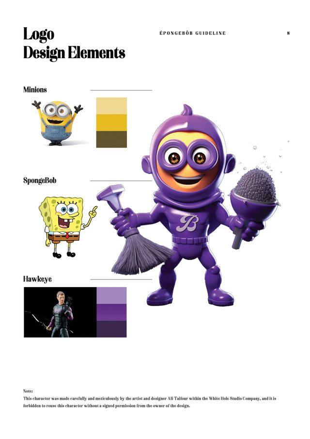
- SpongeBob Cartoon Character: The name "SpongeBob" is instantly recognisable and widely known as the beloved cartoon character around the world. By incorporating this familiar name into this logo, it creates a sense of familiarity and relates it to the cleaning operations costumers undertake.
- Holographic Character: To establish a unique and distinctive identity, we created a new character by combining four different characters. This holographic character stands out in its shape and colours, making it memorable and easily recognisable.
- The logo design reflects Bob's personality as the foundation and driving force behind the company. It showcases his sense of humor, commitment to work, and mastery of the cleaning industry.
- We also paid attention to specific details in the character's design. Bob's character has light brown eyes and distinct hair tied in a particular style, adding a touch of personality and individuality.
- SpongeBob: The character’s name was translated into French as “ÉpongeBöb,” adding a touch of sophistication and international appeal to the brand.
- Minions: Inspired by the lovable Minions characters, we incorporated certain elements such as yellow skin with a slight shade of orange, head shape, glasses, and a friendly smile. These elements contribute to a cheerful and approachable image.
- Hawkeye: To add a vibrant touch, we chose the color violet shades for the character’s clothes, representing creativity and uniqueness. The shape of the character's body complements the overall design.
These carefully selected elements come together to create a captivating and memorable logo. Looking to the future, we plan to introduce more characters based on the services they provide and expand into the realm of 3D animated films, bringing our unique cinematic creations and experience to the industry.
brand user guide
This logo embodies the essence of ÉpongeBöb and showcases the commitment to creativity, quality, and future growth.
In essence, "Stereotype" is a profound journey that resonates long after the final curtain falls. It provokes thought, ignites dialogue, and beckons us all to rediscover the beauty of genuine, unfiltered human connection. Ali Taifour's creation is a testament to the transformative potential of art in dismantling barriers and nurturing understanding among diverse cultures.